The simple answer is everyone should have a website that works well on mobile phones, tablets, and computer screens.
And sometimes it’s worth creating an App, too.
Apps have to be download from iTunes or another app store – and they are especially useful if you’re making a game or some other highly interactive application. But Apps require more investment, and complexity, than mobile websites and they are not always worth the trouble.
IMHO… in my humble opinion, Apps have been overhyped by the “there’s an app for that” Apple ad campaign and any good digital strategy should start with a website that works on all devices — and that means you want to create a responsive website design that works on all screen sizes.
So, the first thing you have to consider is whether to create an App or a mobile website, then you can you can dig deeper into how to do each one.
- An App, or as the geeks would say, a “Native App,” is an application that you have to download from the iTunes store or one of the Android stores.
- A mobile website is a “mobile friendly” website, meaning a website that looks good, and is usable, on a small screen.
In general, creating a native app is far more expensive, in part because you have to create different versions for iPhones, iPads, Androids, Windows 8, Blackberries, and more… Add to that the fact that no one will ever find the content on your app by doing a Google search, and you’ll soon discover what many companies that started with Apps have realized, it’s not a marketing tool, it’s a free product they need to market.
In contrast, a well-designed mobile web strategy means creating a website that will work on all devices (a great ROI), a mobile version that can build on the SEO and desktop site you’ve already established, and a more direct connection to your audience. If you go through the iTunes store, Apple owns the customer relationship, not you. So let’s assume you start by taking my best advice and decide to design a mobile website.
If you’re still not convinced a mobile website is worth the effort, consider this quote from a MarketWire article in Yahoo! Finance this summer:
“The last 12 months have seen a huge 202% increase in mobile web traffic with more than one in ten consumers now using their Smartphones to access the web and a further 3.5% of all visits arriving through a Tablet device.”
What does a good mobile website look like?
A good mobile web design takes into account the small screen size and limited data entry options of mobile phones.
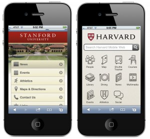
That means designing for “fat finger” syndrome with big buttons that are easy to click on. But even if we all agree that big buttons are important, there are at least two common approaches, illustrated well by the mobile sites at rival universities Stanford and Harvard.

Rival universities Stanford and Harvard demonstrate well the two most common approaches to making links easy to click with a ‘fat finger.”
- Stanford designed their links as big long rows that users can easily scroll through and click with a fingertip. This approach leaves room for more text in the link area, but it limits how many links can be visible at one time.
- Harvard used big, square, buttons, similar to the icons used for iPhone Apps. Because the space for text is so limited, with this approach, we usually add image icons to help identify the content behind the link.
How do you create a mobile website?
There are two distinct approaches to making websites ‘mobile friend:
You can detect what each visitor to your site uses and send them to a version for their screen size and features, or you can create a responsive design that adjusts to different screen sizes.
- How to create responsive / adaptive web designs
- What’s the difference between adaptive and responsive web design?
Never Forget Content is King
One of the most important reasons to design a mobile version of your website is that text is so hard to read on a small screen. Just because your website opens on an iPhone, doesn’t mean it’s possible to read or use on small screen.

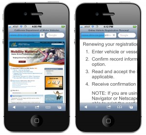
Using a mobile phone to learn how to renew your car registration on the California Department of Motor Vehicles website is almost as frustrating as standing in line there.
Yes, I can pinch and zoom and scroll back and forth, but as you see in the screenshots from the California Department of Motor Vehicles website, this approach to finding out how to renew my car registration is almost as frustrating as standing in line at the DMV.
So when we create mobile websites, we start with creating a design that makes it easy to read and navigate on a small screen, but never forget, what matters most is delivering the right information to the right person in the most effective way possible.
And that gets to the heart of one of the most important aspects of any good mobile design strategy, which is making sure the right content is easy to find. If someone is searching for your restaurant, law office, or veterinary clinic on a mobile phone, there is a good chance they are trying to find your address or phone number.
No matter what approach you take, make sure you’re thinking as much about the content as the design, and make sure your phone number, address, and a map, are never more than a click away from the front page.
Related Articles on Mobile Web Design
- What web address (URL) should you use for your mobile site?
- How to create responsive / adaptive web designs
- What’s the difference between adaptive and responsive web design?
- Learn how to create responsive designs with the new fluid grid layout features in Dreamweaver CS6
- How to use Media Queries to target the iPhone, iPad, and other mobile phones and devices?
- Seven mobile web design tips to get you started

