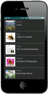
 1. Limit small screen designs to one column: Multi-column layouts just don’t fit on small mobile phone screens.
2. Make links big and easy to click on: Remember most cell phone users struggle with ‘fat finger’ syndrome.
3. Make your phone number easy to find: It seems obvious, but if someone is viewing your site on their mobile phone, there’s a higher than average chance they will want to call you. Don’t bury your phone number in small text at the bottom of your page.
And take the extra minute to add the tel attribute to your phone links. It’s easy to make a phone number work as a link to start a call on almost any phone.
Here’s an example of the code:
<a href=”tel:+1-555-555-555″>Click to Call: +1 (555) 555-5555</a>
4. Use colors with good contrast to make sure your designs are easy to read in low and bright light — then test your designs inside in low light and outside in bright light to make sure they’re readable.
5. Put navigation menus as the bottom of the screen, not the top. Navigation links take up too much room on a mobile screen. Instead, include a Menu link at the top of each page that jumps down to link options at the bottom.
6. Don’s use Flash. If your Web site is designed in Flash, create a simple alternate design that will display on devices (including the iPhone and iPad) that don’t display Flash.
Make sure the simplified mobile version of your site has the most relevant information formatted in clean HTML so that works on all devices. For example, if you’ve created a site for a restaurant in Flash, create an alternate version with the information someone is most likely to need when they visit your site on a phone.
7. Add a Map and Directions: If you want people to find your physical location (restaurant store, etc) the most important thing to include on your mobile site? Your address and links to Google Maps or Mapquest (both of which offer mobile-friendly versions). And of course, don’t forget your phone number with the tel tag attribute (which makes the number easier call.
Overall, to reach the broadest mobile audience, keep pages light: Limit the amount of text and images on each page to no more than 2 or 3 small screenfulls of content and your pages will be easier to read on small mobile phones.

Hi..
This has been a huge help for myself and my team members! We needed comprehensive help and direction to finish project on time. Hopefully with all the resources you gave we can get it done! Thanks a million!.