If you’re working with a graphic, such as a logo, cartoon character, or drawing that can be displayed in 256 colors or less, your best bet is to use the PNG format and reduce the total number of colors used in the image as much as possible to reduce the file size. (If you are concerned about visitors using a very, very old Web browser, use GIF instead.)
To help make up for the degradation in image quality that can happen when colors are removed, GIF and PNG use a dithering trick. Dithering involves alternating pixels in a checkerboard-like pattern to create subtle color variations, even with a limited color palette. The effect can smooth the image’s edges and make it appear to have more colors than it actually does.
To convert an image to a GIF or PNG in Photoshop, follow these steps (in Photoshop Elements or Fireworks, the process is similar although the specific steps may vary):
1. With the image open in Photoshop, choose File > Save for Web & Devices (or File > Save for Web).
The Save for Web & Devices dialog box appears.
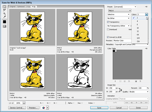
2. In the top-left corner of the dialog box, choose 2-Up or 4-Up to display multiple versions of the same image for easy side-by-side comparison.
In the example shown in Figure 3-4, I chose 4-Up, which makes it possible to view the original image (in the upper-left corner), as well as three different previews of the same image.
3. Select a preview image to begin changing its settings.
Changing the preview images in the 4-Up view enables you to compare an image with up to four different color settings, as you see in this Figure.
The GIF and PNG formats are best for images with limited colors, such as cartoons and line art. (Illustration by Tom McCain)
4. On the right side of the dialog window, just under Preset, click the small arrow to open the Optimized File Format drop-down list and choose either GIF or PNG.
5. In the Colors box, select the number of colors, as shown in the figure above.
The fewer colors you use, the smaller the file size and the faster the image will download. But be careful, if you reduce the colors too much (as I have in the bottom-right preview shown above), you lose details. The ideal number of colors depends on your image; if you go too far, your image will look terrible.
6. If you want to maintain a transparent area in your image, select the Transparency check box.
Any area of the image that was transparent when you created the image in the editor appears transparent in the preview window. If you don’t have a transparent area in your image, this setting has no effect.
Transparency is a good trick for making text or an image appear to float on a Web page. That’s because a transparent background doesn’t appear on the Web page. You can select transparency as a background option in the New File dialog box when you create a new image in Photoshop or Photoshop Elements.
7. If you choose Transparency, also specify a Matte color.
You want the matte color to match the background of your Web page so that the dithering along the transparent edge will blend in with the background. If you don’t specify a matte color, the transparency is set for a white background, which can cause a halo effect when the image is displayed on a colored background.
8. Specify other settings as desired.
The remainder of the settings in this dialog box can be left at their defaults in Photoshop.
9. Click Save.
The Save Optimized As dialog box opens.
10. Enter a name for the image and save it into the images folder (or any other folder) in your local site folder.
Repeat these steps for each image you want to optimize as a GIF or PNG for your site.
Trial and error is a great technique in the Save for Web & Devices dialog box. In each of the three preview windows displaying optimized versions of the cool sun cartoon image in the figure above, I used fewer and fewer colors, which reduced the file size with increasingly degrading effect.
The version in the top left of the dialog box is the original, which has a file size of 92.6K. Reducing the image to 256 colors dramatically reduced the file size to 12.24K, but made little noticeable change to the image, as you see in the top right. In the bottom left, the image is reduced to 64 colors, which brought the size down to 7.959K, but still made little change to the quality of the image.
In the bottom right, I reduced it to 2 colors, and the image quality suffered dramatically. Although it’s harder to tell in the black-and-white reproduction in this book, all the color and details disappeared, leaving just a black and white outline. In this last case, the small savings in file size are clearly not worth the loss of image quality.
Creating and Optimizing images with Adobe Photoshop Save for Web

