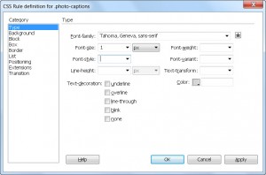
 The CSS Rule Definition dialog in Dreamweaver makes it easy for you to choose among the many CSS options you can use to define the formatting and other options you want to include in any style you create.
The following article provides an overview of the many options available in this CSS dialog.
Bookmark this page and use it as a reference
Don’t feel you have to memorize all these options; bookmark this page and you can always refer to this list when you’re creating new styles and want to check your options.
The CSS Rule Definition dialog includes eight categories, each with multiple options. All these choices can seem a bit daunting at first, which is why I created this overview of the options in each category.
I’ve included the full list here so you have a reference to all the options , but most of the im you’ll only use a few options from one or two categories for each new style you create..
Create just the style rules you need
Also remember, you don’t have to specify any of the settings in the dialog boxes – all of these are optional. When you leave any option blank, you let the default browser settings (or other styles) already applied to the page take control. For example, if you don’t specify a text color in the body style, all of the text on your page remains black — the default color in most web browsers, unless another style, such as a Heading style, is applied to change the text color.
TIP: Not all the options in the CSS Rule Definition dialog box are supported by all the web browsers in use today, so the way styles are displayed on a web page can vary depending on the browser. Similarly, some CSS options aren’t included in Dreamweaver because they’re not commonly supported. The following section describes the options in each of the categories offered in the CSS Rule Definition dialog box in Dreamweaver versions CS5, CS5.5 and CS6.
The Type category
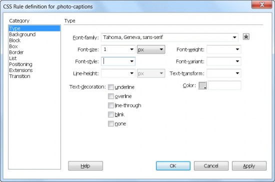
The Type category features some of the most common style options, those used to (you guessed it) the text in your pages. With the Type category selected (see figure), you have the following formatting options:
- Font-Family: Specifies a font, a font family, or a series of families. You can add fonts to the list by choosing Edit Font List in the drop-down list.
- Font-Size: Defines the size of the text. You can choose a specific numeric size or a relative size. Use the drop-down arrow to select from a list of options that includes ems and percentages. (For more on these options, see my post comparing CSS size options.)
- Font-Style: Enables you to choose whether the text appears as normal, italic, or oblique. (Italic and oblique are rarely different in a web browser, so stick with italic unless you have a specific reason not to.)
- Line-Height: Enables you to specify the height of a line on which the text is placed (graphic designers usually call this leading). You can specify line height in a variety of ways, including pixels, picas, and percentages. (For more on these options, see my post comparing CSS size options.)
- Text-Decoration: Enables you to specify whether text is underlined, overlined (a line appears over the text), displayed with a strikethrough, or displayed with the blink effect (which makes text appear to flash on and off).
TIP: You can also choose None, which removes all decorative effects. The None option removes the underline from linked text. And please, use the other decoration options sparingly, if at all. Links are underlined automatically; if you underline text that isn’t a link, you risk confusing viewers. Overlined and strikethrough text can be hard to read. Use these options only if they enhance your design. And by all means, resist the blink effect; it’s distracting and can make the screen difficult to read.
- Font-Weight: Enables you to control how bold the text appears by using a specific or relative boldness option.
- Font-Variant: Enables you to select small caps. Unfortunately, this attribute isn’t supported by most browsers.
- Font-Transform: Enables you to globally change the case of selected words, making them all uppercase, all lowercase, with initial caps, or with no capitalization.
- Color: Defines the color of the text. You can use the color well (the square icon) to open a web-safe color palette in which you can select predefined colors or create custom colors. You can also enter any hexadecimal code in this field; just make sure to include the pound sign (#) at the beginning. For example, you would enter #ffffff for white.
After you select the Type options for your style sheet, click Apply to apply them, and click OK to save the settings and close the CSS Rule Definition dialog box.
Why so many fonts?
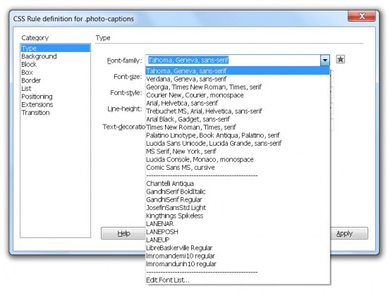 You may have heard that you can now use any font you want on your web pages, thanks to CSS3. This statement is mostly true (at least for anyone using the latest web browsers) but with some limitations: You must have the legal right to publish the font, and the font must be hosted on a web server.
Whether you use the most common fonts, which are included in font collections in Dreamweaver or you use a hosted font with the @font-face rule, you need to include the name of the font in a style using the font-family rule in your style sheet. In this section, you learn how to use the CSS Style Definition dialog box option to define a font-family rule using the font collections included in Dreamweaver.
When you use the font-family rule in a style to format text on your web pages, you don’t have complete control over how that font appears on your visitor’s computer. Unless you use the @font-face rule, the browser has to be able to find the font on the hard drive of the computer that displays the web page.
To help ensure that your text appears as you intend, Dreamweaver includes collections of the most common fonts on Windows and Macintosh computers (the ones that your visitors are most likely to have), grouped together in families, such as
- Arial, Helvetica, sans serif
- Georgia, Times New Roman, Times, and serif
When you apply a collection of fonts, the browser displays the formatted text in the first font available in the list. For example, if you choose the font collection that starts with Georgia and your visitors have Georgia on their hard drives, they see your text in Georgia. If they don’t have Georgia, the text is displayed in the next font on the list that your visitors do have — in this case, Times New Roman. If they don’t have that font either, the text is displayed in Times. And if they don’t even have Times (which would be very unusual), the browser looks for any serif font. (Serif describes fonts, such as Times, that have those little curly things on the edges of letters; sans serif means no curly things, which is what you get with a font such as Arial.)
You can create your own font collections by selecting the Edit Font List option from the bottom of the Font-Family drop-down list in the Property inspector or in the Type category of the CSS Rule Definition dialog box. In the Edit Font List dialog box, shown in the figure, you can do the following:
- Add or remove a font collection by using the plus and minus buttons at the top of the Edit Font List dialog box.
- Add individual fonts to a collection by selecting the font name from the bottom right of the dialog box and using the double <<left arrows to add it to a font list.
- Remove a font from a collection by using the double >>right arrows.
The only way to ensure that text appears in the font you want is to create the text as a graphic in a program, such as Photoshop or Fireworks, and then insert the graphic with the text into your page. That’s not a bad option for special text, such as banners or logos; but it’s usually not a good option for all your text because graphics take longer to download than text and are harder to update later.
The Background category
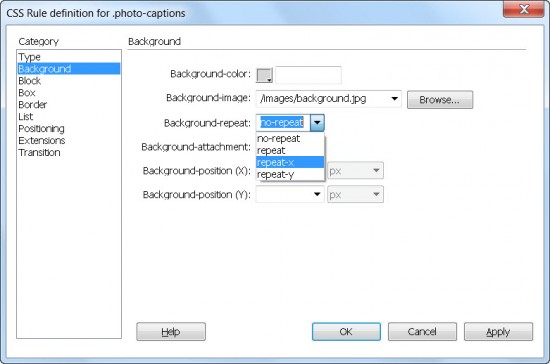
Using the Background category in the CSS Rule Definition dialog box (shown in this figure), you can specify a background color or image for a style — and control how the background is displayed on the page. You can use background style settings for any element of your web page that can display a background — including <div> tags and heading tags. For example, you could alter the <body> tag to include background settings that apply to the entire page, or you could create an ID style with a background setting that would add a background color only to an individual <div> tag. By including the background in the ID style of a <div> tag, you can limit the background to appear on-screen only where the <div> tag is used.
In the example shown this figure, I’ve defined the rule for an ID style named #container to include a background image, which I’m further defining with the No-Repeat option. Another advantage of CSS is that it includes more precise control of background images than is possible with HTML — which, by default, repeats a background image across and down a page.
You can choose from these Background options:
- Background-Color: Specifies the background color of a defined style. You can use the color well to open a web-safe color palette in which you can select predefined colors or create custom colors. You can also enter a hexadecimal color code; just make sure to include the #, as in #000000 for the color black.
- Background-Image: Enables you to select a background image as part of the style definition. Click the Browse button to select the image.
- Background-Repeat: Determines how and whether the background image tiles across and down the page. In all cases, the image is cropped if it doesn’t fit behind the element to which the style is applied. The Repeat options are
- No-Repeat:The background is displayed once at the top left of the element.
- Repeat:The background image repeats vertically and horizontally in the background of the element.
- Repeat-X: The background repeats horizontally, but not vertically, in the background of the element.
- Repeat-Y:The background repeats vertically, but not horizontally, in the background of the element.
- Background-Attachment: This property determines how the background behaves when the page is scrolled. The options are
- Fixed: The background remains glued to one place in the viewing area and doesn’t scroll out of sight, even when the web page is scrolled.
- Scroll: The background scrolls along with the web page.
- Background-Position (X): Enables you to align the image left, center, or right, or to set a numeric value to determine the precise horizontal placement of the background. You can use horizontal positioning with only No-Repeat or Repeat-Y.
- Background-Position (Y): Enables you to align the image top, center, or bottom, or to set a numeric value to determine the precise vertical placement of the background. You can use vertical positioning with only No-Repeat or Repeat-X.
The Block category
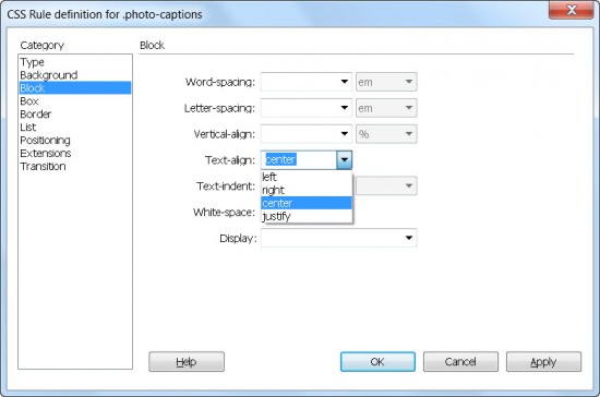
The Block category (see figure) defines the spacing and alignment settings and is commonly used for styles that will define the display of text on a web page.
You can choose from these Block category options:
- Word-Spacing: Defines the amount of white space inserted between words in points, millimeters (mm), centimeters (cm), picas, inches, pixels, ems, and exs. (See my post comparing CSS size options.)
- Letter-Spacing: Defines the amount of white space inserted between letters in points, millimeters (mm), centimeters (cm), picas, inches, pixels, ems, and exs.
- Vertical-Align: Aligns inline elements, such as text and images, in relation to the elements that surround them. Your options are Baseline, Sub, Super, Top, Text-Top, Middle, Bottom, and Text-Bottom, or you can set a numeric value.
- Text-Align: Enables you to left, right, center, or justify your text. You can use this setting, for example, as part of the definition of an ID style when you want to align the contents of a <div> tag, as when you center the text in a footer.
- Text-Indent: Specifies how far the first line of text is indented. Negative numbers are allowed if you want the first line to begin outdented. However, be careful that your text doesn’t end up so far outdented that it’s off the page.
- White-Space: Tells the browser how to handle line breaks and spaces within a block of text. Your options are Normal, Pre (for preformatted), and Nowrap, which prevents elements from being separated if they must wrap to fit within a browser window or other container.
- Display: Indicates how to render an element in the browser. For example, you can hide an element by choosing None and change the positioning of an unordered list from horizontal to vertical by choosing Inline.
The Box category
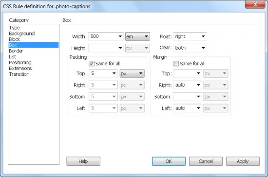
The Box category (see figure) defines settings for positioning and spacing. These settings are ideal for creating page layouts with ID styles to position <div> tags.
You can use the Box category properties to set these values:
- Width: Enables you to specify a width for any element that can have its dimensions specified, such as a <div> tag. You can use pixels, points, inches, centimeters, millimeters, picas, ems, exs, or percentages for your measurements.
- Height: Enables you to specify a height for any element that can have its dimensions specified.
TIP: The Height field is often left empty to enable elements (such as <div> tags) to expand to fit their contents.
- Padding: Sets the amount of space within the borders of an element. For example, you can use padding to create space between the borders of a <div> tag and its contents. You can set padding separately for the top, right, bottom, and left. Padding is measured in pixels, points, inches, centimeters, millimeters, picas, ems, exs, and percentages.
- Float: Enables you to align elements, such as images and <div> tags, to the left or right of a page or other container causing text or other elements wrap around it.
- Clear: Prevents floating content from overlapping an area to the left or right, or to both sides of an element. This option is useful for preventing overlapping of elements, especially when the Float option is used.
- Margin: Sets the amount of space around an element. Margins can be used to create space between the edge of an element and other elements on the page, such as between an image and text or between two <div> tags. You can set the margin separately for the top, right, bottom, and left. Padding is measured in pixels, points, inches, centimeters, millimeters, picas, ems, exs, and percentages.
WARNING: Setting padding and margin spacing can be tricky because they add to the overall size of your image, <div> tag, or other element.
The Border category
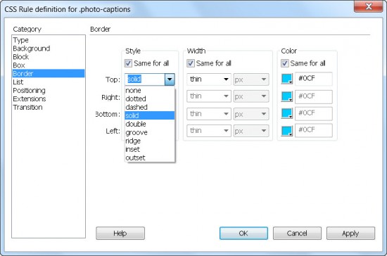
The Border category defines settings such as Width, Color, and Style and is commonly used to define borders around images, tables, and <div> tags. As shown in this figure, you can specify border settings on all four sides of an element or create borders on only one, two, or three sides of an element. With this technique, you can use the border settings to create dividing lines between <div> tags that create columns or add separating lines above or below elements.
The List category
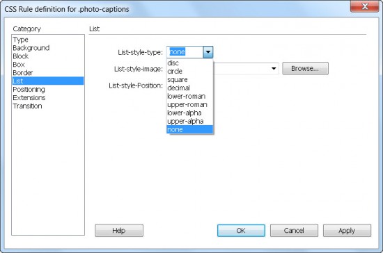
The List category defines settings such as the size and type of bullets for list tags. You can specify whether bullets are Disc, Circle, Square, Decimal, Lower-Roman, Upper-Roman, Lower-Alpha, Upper-Alpha, or None (see figure). Choose None if you want to use the list tag with no bullet. If you want to use a custom bullet, you can use the Browse button to insert an image to be used as the bullet. You can also control the location of the list bullet in relation to the list item.
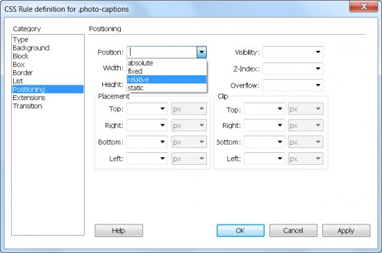
The Positioning category
The Positioning category (see figure) enables you to alter the way elements are positioned on a page. Positioning can dramatically change the way block-level elements appear in a browser. Block-level elements include table, list, header, paragraph, and <div> tags. For example, AP Divs in Dreamweaver are simply <div> tags that use absolute positioning to place elements in a specific part of a page.
Positioning is always determined relative to something else, such as another element on the page or the browser window. How you set up positioning depends on where your element is on the page — and on whether the element is inside another element (such as a <div> tag).
Here are the Positioning options:
- Position: Enables you to specify the position of an element, such as a <div> tag. Options include
- Absolute: Uses the top and left coordinates to control the position of an element relative to the upper-left corner of the browser window or the upper-left corner of an element that contains the element. (For example, the positioning of an AP Div contained within another AP Div is based on the position of the first AP Div.)
- Fixed: Positions an element relative to the top-left corner of the browser. The content of an element using fixed positioning remains constant even if the user scrolls down or across the page.
- Relative: Uses a position relative to the point where you insert the element into the page or relative to its container.
- Static: Places the content at its location within the flow of the document. By default, all HTML elements that can be positioned are static.
- Width and Height: Enables you to specify a width and height that you can use in styles you apply to images, <div> tags, or any other element that can have its dimensions specified. These settings serve the same function as the Width and Height in the Box category. Entering a value in either category causes the same value to appear in the other.
- Placement: Defines the size and location of an element within its containing element. For example, you can set the right edge of the element to line up with the right edge of the element that contains it. You can specify the Top, Right, Bottom, and Left options separately and you can use pixels, points, inches, centimeters, millimeters, picas, ems, exs, or percentages for your measurements. (See my post comparing CSS size options for the basics about ems, exs, percentages, and the new rems.)
- Visibility: Enables you to control whether the browser displays the element. You can use this feature with a scripting language (such as JavaScript) to change the display of elements dynamically. For example, you can cause an element to appear on a page only when a user clicks a button — and then make the element disappear when the button is clicked again. The Visibility options are
- Inherit:The element has the visibility of the element in which it’s contained. This is the default.
- Visible: The element is displayed.
- Hidden:The element isn’t displayed.
- Z-Index: Controls the position of an element, such as an AP Div, on the Z-coordinate, which controls the stacking order in relation to other elements on the page. Higher-numbered elements overlap lower-numbered elements. (Note: This setting only works on elements that use absolute or relative positioning settings.)
- Overflow: Tells the browser how to display the contents of an element if the container, such as a <div> tag, can’t fit the element’s entire size.
- Visible:Keeps content, such as an image or text, visible, even if it expands beyond the defined height or width of a container.
- Hidden:Cuts off the contents if they exceed the size of the container. This option doesn’t provide scroll bars.
- Scroll:Adds scroll bars to the container regardless of whether the contents exceed the element’s size.
- Auto:Makes scroll bars appear only when a container’s contents exceed its boundaries.
- Clip: Specifies which part of an element is visible (by controlling which part of the element is cropped) if the content of an element overflows the space allotted and you set the Overflow property to Scroll or Auto.
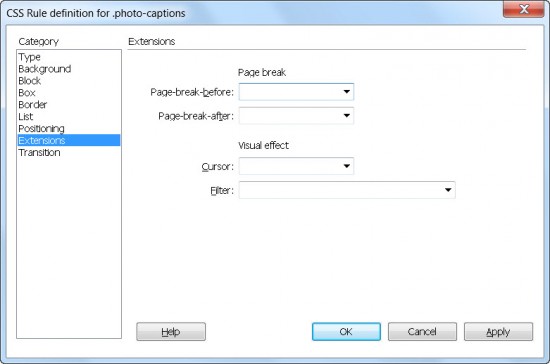
The Extensions category
Extensions (see figure) include filters and cursor options:
- Page-Break: Inserts a point in a page — either before or after an element — where a printer sees a page break. This option enables you to better control the way a page is printed.
- Cursor: Defines the type of cursor that appears when a user moves the cursor over an element.
- Filter: Enables you to apply special effects, such as drop shadows and motion blurs.
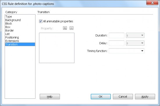
The Transition category
The Transition category, shown in this figure, provides a new set of options added in version CS6. The Transition category is designed to help you create and manage CSS3 transitions, which can be used to create interactive effects by gradually changing the style of an element from one property to another.
The Transition category has the following options:
- All Animatable Properties: Select this box if you want the transition rule to apply to all the elements on the page that can be animated.
- Property: Enables you to specify which CSS property you are targeting with the effect. Click the plus sign (+) to add a property or the minus sign (–) to remove one.
- Duration: Defines the length of time the transition will take to complete.
- Delay: Specifies a time delay between when a page loads and when the transition begins.
- Timing Function: Enables you to choose the type of transition you want from the drop-down list.

Hi Janine,
You have written very useful article. Very helpful to me. Thanks.
[…] Using the CSS Rule Definition Panel […]
[…] How to use the CSS rule definition panel for styles in … – The CSS Rule Definition dialog in Dreamweaver makes it easy for you to choose among the many CSS options you can use to define the formatting and other options you …… […]