How to target designs for the iPhone, iPad and desktop computers
Excerpted from iPhone & iPad Web Design For Dummies
Updated 1-2013 since last publication
By Janine Warner & David LaFontaine
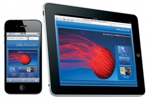
Using CSS Media Queries you can change the design of a web page to display differently on an iPad than on an iPhone.
The latest trend in web design requires creating one HTML page and then designing multiple style sheets to change the display based on the size of the screen where the page is viewed.
When you design web pages with CSS, you can create multiple collections of style designed specifically for each device, and you can target those styles using media queries set to a specific browser width.
CSS has included the ability to use media queries since before version 3, but in the past, media queries were primarily used to target style sheets based on options, such as whether the page would be printed or displayed on a computer.
Targeting iPhones, iPads, and other Computer Screens
Today, web sites are viewed on giant desktop monitors and tiny mobile displays which is why media queries are so much more important — because they give us the ability to target styles based the size of the screen area or the aspect ratio (you can target portrait and landscape views by targeting their relative widths, which is especially useful when you’re designing for the iPhone and iPad).
The ability to target devices in CSS makes it possible to use different style sheets for different types of displays: desktop and laptop monitors, iPad-size screens, or iPhone-size screens. If you don’t use media queries to target your CSS, the iPhone and iPad automatically adjust your designs for you, shrinking or enlarging the page to best fit the screen (and like most automated results, resizing results in less than ideal results.
Using media queries gives you more control so you can adjust the text size, colors, and positioning of elements based on the space you have on the screen.
Setting Up Media Queries: Specifying media types and features
A media query is made up of a media type, such as screen or print (the two most common), and an optional expression that checks for particular features, such as the height or width.
Here the media types supported on the iOS platform:
- all: Suitable for all devices
- print: Designed for print preview and for display when a page is printed
- screen: For content displayed on any screen
Don’t be confused by the Handheld media type, which is best for very limited cell phones and other devices with small screens, limited bandwidth, and monochrome displays that support only bitmapped graphics. iOS devices are categorized as screen media types.
Comment Tags are for notes
Note that the comment tags in the code below are optional. When you comment code in HTML, you use the <!– –> tags:
<!– comment here –!>
I include comment tags only to make the code easier for humans to read.
CSS Media Querie Example to Target Portrait and Landscape
This version uses 4 style sheets,
<!–iPad portrait –>
<link href=”css/ipadP.css” rel=”stylesheet” media=”only screen and (min-device-width: 768px) and (max-device-width: 1024px) and (orientation: portrait)”>
<!–iPad landscape –>
<link href=”css/ipadL.css” rel=”stylesheet” media=”only screen and (min-device-width: 768px) and (max-device-width: 1024px) and (orientation: landscape)”>
<!–iPhone portrait –>
<link href=”css/iphoneP.css” rel=”stylesheet” media=”only screen and (min-device-width: 320px) and (max-device-width: 480px) and (orientation: portrait)”>
<!–iPhone landscape –>
<link href=”css/iphoneL.css” rel=”stylesheet” media=”only screen and (min-device-width: 320px) and (max-device-width: 480px) and (orientation: landscape)“>
For more about designing for Apple’s wildly successful iPhone and iPad, please check out our book iPhone and iPad Web Design for Dummies.
CSS Media Queries from Dreamweaver CS6
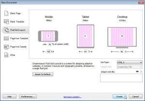
Dreamweaver CS6 uses a new Fluid Grid layout system to make it easier to create and target multiple style sheets.
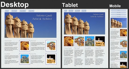
The media queries created by Adobe Dreamweaver CS6 create 3 designs, with 3 sets of CSS style sheets, for desktop, tablet, and smart phone screen sizes
How to apply media queries with styles to HTML page designs
You can apply style sheets by linking them, importing them, or embedding them as internal styles into the head region of your page’s HTML. You can even target devices using inline styles — a handy option if you want to apply a specific rule only to certain devices (see the example in the “Creating inline style rules” section that follows).
You can use a combination of these options, and you can import, or link, multiple external style sheets to the same Web page. you’ve defined the media type with the media features you want to target, you specify how the styles should be applied to the page using one of the following options:
Targeting devices when linking external style sheets
The most common (and generally most recommended) option is to link external CSS style sheets to each HTML page. The code for the CSS and HTML are saved in separate files, and the <link> tag connects the two.
You can link multiple style sheets to one HTML page. For example, you can create one style sheet for styles that format text and another for layout styles. You can also create external style sheets for different purposes, such as one for print and one for screen display. One of the biggest advantages of external style sheets is that they make it faster and easier to create new pages, and they make it possible to update styles across many pages at once. Note: You can attach more than one external style sheet to the same Web page.
Include the <link> tag within the <head> and close </head> tags at the top of the HTML code of a web page. The following example includes two style sheets @@md one designed for a computer screen and the other designed for print:
<link rel=”stylesheet” type=”text/css” media=”screen” href=”screenstyles.css”>
<link rel=”stylesheet” type=”text/css” media=”print” href=”printer.css”>
You can use a similar technique to target iPhone and iPad devices. Thus, in addition to (or instead of) the two previous style sheets for print and screen, you can link to style sheets that target the iPhone and iPad. This example links four separate style sheets to a web page, each designed for optimal display in the iPhone or iPad in landscape and portrait modes.

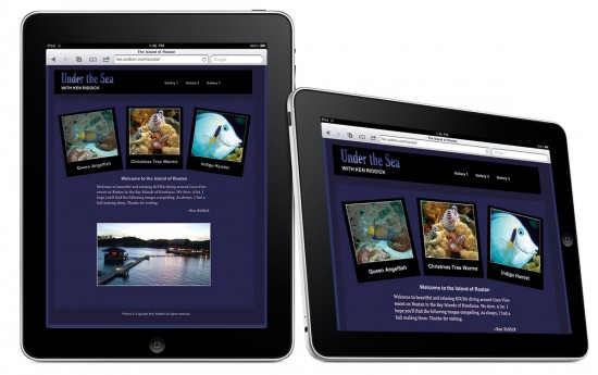
Very nice article for beginner mobile designers like me.
teach me on how to insight or place or attach facebook, twitter, google, gmail etc logo by the side of one of the div or in my site.
One of the logo will be visible when browse but the rest will drop down when place the cursor on the visible logo. ie other will be hidden underneath the first logo.
One of the easiest ways I’ve found to add social media icons to a div, or anywhere else on your web page, is using the AddThis service http://www.addthis.com/. You’ll find many other great social media tools and resources in this article http://www.digitalfamily.com/tutorials/my-favorite-social-media-tools-to-build-your-network-measure-influence-and-track-trends/
You’ll find a link to the AddThis social media sharing tool, as well as many other social media tools in this article http://www.digitalfamily.com/tutorials/my-favorite-social-media-tools-to-build-your-network-measure-influence-and-track-trends/
[…] Code Beispiel […]