If you answer yes to 3 or more of these points, it’s definitely time to redesign your website or blog.

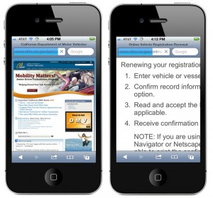
Just because I can open your site on a smart phone, doesn’t mean it’s usable. If I have to enlarge your text so much it to read it that it doesn’t fit on the screen, you’re site is not mobile friendly.
I can’t read your text on a mobile phone
The growing mobile web audience has led to new approaches in web design. Today the best sites use a technique called Responsive Design to adjust the size and positioning of page elements to best fit small and large screen sizes. If you can’t read the text on your website when you view it on a mobile phone, or worse, you can’t even see it on a mobile phone, it’s definitely time to join the modern mobile world.
Hint: If you use Adobe Flash on your site, you’re not mobile friendly. The modern approach is to use HTML, CSS, and Javascript to add animations and other interactive features in a way that works on most devices on the web. Anywhere you use Flash in a website, just shows up as a big blank area on iPhones and iPads.
It’s really hard to update
Some web design tools are harder to use than others. The best websites are designed with programs like WordPress that make it easy to post new updates and edit the content when things change. And things always change.
The copyright hasn’t been updated since 1999
It’s 2013, is that what your copyright says? When you redesign your site, make sure you use a little PHP in that copyright field and the date will change automatically next January 1. Follow this link to discover just how easy it is to automate changing the date from now on.
Your images are tiny, but it still takes forever to download
Explore the web and you’re sure to appreciate how beautiful sites are when they use big, bold images. Full screen photos and highly graphical designs make the web a more beautiful place. If your front page still features tiny little images, we all know right away that you haven’t updated your site in years. Worse yet, even with those tiny images, if they’re not optimized or you’ve got bloated code under the hood, your pages are taking longer than they should to download. Google favors sites that load fast, and so do visitors.
Even you can’t find what you’re looking for
If you’re site has grown organically over the years, it’s probably not as well organized as it could be. Taking a little time to rethink the structure of your site, improve the navigation links, and even add a search engine, can help visitors find what they’re looking for, and makes them more likely to come back.
Some things just don’t work anymore
Does your contact form return a code error? Are there broken links, missing images, or other dysfunctional aspects of your site? Then it’s definitely time to redesign.
 Zombie content haunts your pages
I’m on a mission to rid the web of ROT (Redundant, Outdated, and Trial) content. A successful redesign is as much about improving, updating, and enhancing the content, as changing the look and feel. Sure, you want your site to look great, but if the content doesn’t answer your visitor’s questions, inform, entertain, and ultimately drive your visitors to action, you’re missing the point.
Learn more in my new course: Redesigning Your Website or Blog
Check out my new creativeLIVE course (recorded live on Thursday and Friday, Sept 26th & 27th).

I’m so looking forward to your course!
I unfortunately won’t be able to watch live as I teach kindergarten but I’ll be catching the rewatch whenever I can!
[…] read the rest of Janine’s 7 Signs article, visit her […]