Don’t have the bandwidth to download the video files? Order the DVD and we’ll send it via Priority Mail to almost anywhere in the world.
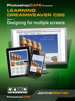
Discover how to create web designs that look great on large and small screens. From smartphones to tablets to desktops, the new Fluid Grid Layout in version CS6 makes it easier than ever to set up media queries and design websites with HTML5 and CSS3.
Description
Creating Responsive Designs for small and large screens with Fluid Grid Layouts
With all the hype about designing web sites for mobile phones and tablets, it’s no surprise that the most impressive features in Dreamweaver CS6 make it easier to create designs that look great on small and large screens.
In this 2-hour training video, award-winning author and video host, Janine Warner, introduces you to Dreamweaver’s new fluid grid layout features and shows you how to create one, well-crafted HTML file and then use three sets of CSS styles to adapt the design for mobile phones, tablets, and desktops. You’ll also learn how to use Media Queries to target styles sheets, and how to make the most of the new Web Fonts features.
Watch the introduction to Designing for Multiple Screens with Dreamweaver CS6
Table of Contents
Intro/welcome
1. Designing for Desktop, Mobile, and Tablet Devices (7 minutes)
2. Introducing the Dreamweaver CS6 Interface
(6 minutes)
3. Setting up a New Site in Dreamweaver CS6
(9 minutes)
4. Creating a New Fluid Grid Layout (9.5 minutes)
5. Inserting Fluid Grid Layout Div Tags
(6 minutes)
6. Saving Files and Adding Content
(10.5 minutes)
7. Inserting Images and Backgrounds
(12 minutes)
8. Adjusting and Aligning Columns (6 minutes)
9. Creating Different Image Styles for Each Layout (17.5 minutes)
10. Adding Fancy Fonts with @font-face (16.5 minutes)
11. Reviewing Boilerplate.css and Other Styles (14 minutes)
12. Styling Navigation Buttons with CSS (14 minutes)
13. Setting Up Your Own Media Queries (8.5 minutes)
Thank you!

